Brief/Introduction
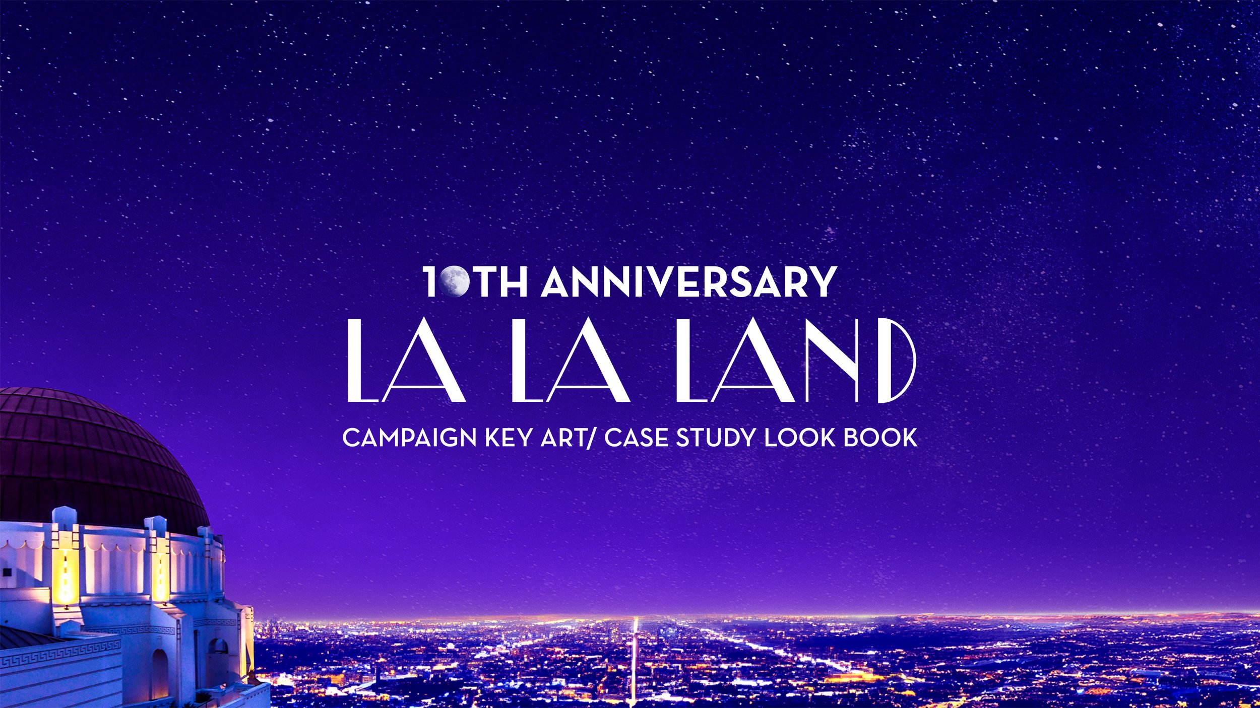
La La Land a very iconic movie and one of my favorites is getting close to it’s 10 year anniversary. Tasked with creating the visual identity for La La Land’s 10th Anniversary release, this project challenged me to bridge the gap between nostalgia and contemporary design while honoring one of modern cinema’s most visually distinctive musicals.
Challenges
Difficulties are finding ways to celebrate the film’s legacy, appealing to the fans as well as inviting a new audience. Bringing in the old school Hollywood themes and trying to keep it modern. Finding a way to translate the key art across the scope of a campaign.
Strategy
During the planning and conceptual phase I focused primarily on exploring ways of evolving the original identity of the key art in the movie poster and finding ways to reinterpret it while maintaining the themes of the movie. Themes that I explored were dreams vs reality, past vs present, love vs ambition.
Target Audience
Primary:
Original fans (now 10 years older)
Film enthusiasts/collectors
Musical theater/jazz fans
Romance genre admirers
Secondary:
New generation of film viewers
Art house cinema audience
Digital-native content creators
Film students/aspiring filmmakers
Early Sketching
In the early sketching stages I explored composition and placement of motifs and themes and see how they worked together initially to see if I can get an idea to work together. These initial stages are mainly drafting quick ideas. I knew I wanted to use iconic moments from the film. I would sketch out other ideas later in the process as well.
Exploring Concepts
During this phase I started refining by collaging images and adding color to get a better feel and playing around with the collages. I knew I wanted to keep the poster somewhat on brand to retain the feel of the original and recognizable.
Feedback I got was the concept is too similar to the first movie poster so I went back to the themes of the movie to explore other ideas to flesh out.
Exploring Concepts 2
I tried exploring different ideas such as the piano since it plays throughout the movie. Played with blues that show up in the movie as well exploring other scenes.
I was still trying to keep the ideas simple and trying to avoid overcomplicating. Looking at all the posters I was trying to see which ones were direct in telling the story without having to analyze and think so much.
Exploring Concepts 3
I chose the planetarium concept because it was the most direct in telling the story. It was an iconic scene and focuses more on the dream/fantasy aspect of the movie that I think many aspiriring dream chasers can connect to.
From there I refined the poster more in photoshop by adding overlays of color, gradients, lighting and playing around with details. I played with the title of the movie as well to see how it would interact and see if it can help tell the overall story. I also tried making an illustrative style to see how it would change the feel.
Finalized Concept
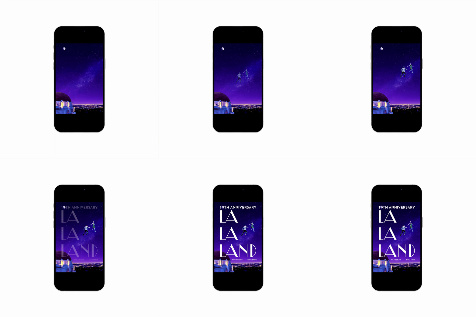
For the final concept of the movie poster I reimagined the iconic planetarium scene being a metaphor of dream vs reality and the journey of time. The composition is made to be an L shape creating a hierarchy with the title and guiding the viewers from the anniversary title to the floating figures that are framed with the negative space. The color palette shifts from the original poster’s signature hues to the deep blues of the planetarium scene showing a shift in time. By adding more lighting in the city and the sky it celebrates the 10 year milestone. Integrating the moon reinforces the celebration and specialness of the milestone. For many fans this is a different take on a popular scene and for newer viewers it’s an invitation to the fantasy/dream and for both audiences it reinforces the message of pursuing dreams.
Mock Ups
I took the initial poster design and branched the key art into other applications that I could see being part of an overall campaign. Being a rerelease it can be seen as a refresh across merchandise, promotional, streaming, social, and so on.
The title of the movie in the key art is adapted to fit the containers the best it can to retain the feel while the movie poster tells the story.
Movie Posters
Vinyl soundtrack art
Streaming on MAX
Social Media
Promotional Ticket
Step and next back drop


